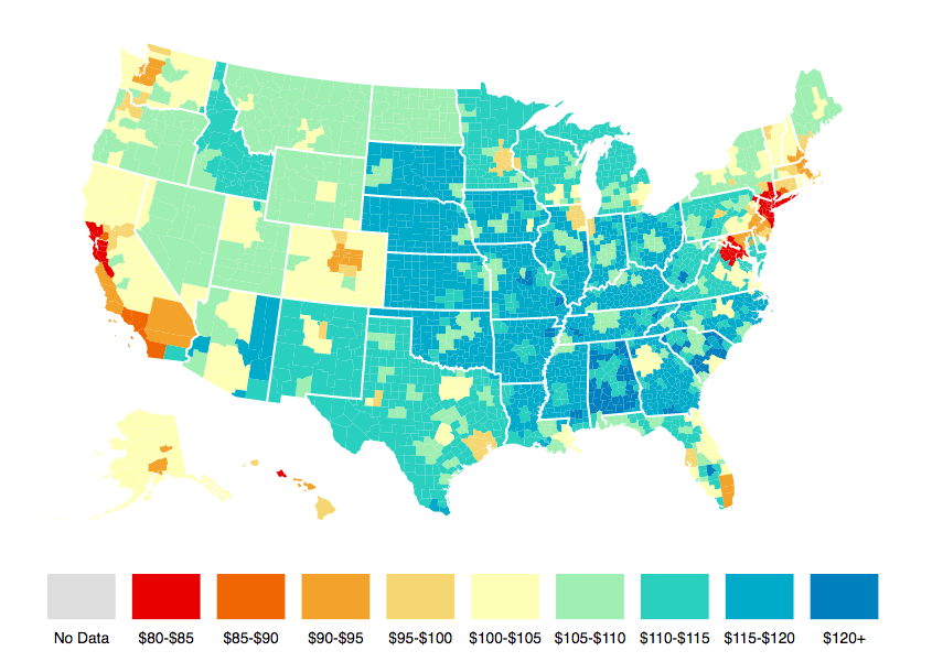
Chart: What's The Cost of Living In Your Community?
Another great interactive map from Visual Capitalist (CEO Jeff Desjardins recently appeared on NGPF podcast) showing the relative value of $100 in communities across the U.S. (go directly to the map on the website which will allow you to scroll over to get information on your specific metro areas):

Questions:
- Which states/regions seem to have lowest cost of living (where $100 is worth the most)?
- Which states/regions seem to have highest cost of living (where $100 is worth the least)?
- What do you think is the relationship between cost of living and salaries? Would you expect that people earn more/less in salary in region with low cost of living? Why?
- Will the cost of living in a given city/state affect where you want to settle after school?
----------
Check out the NGPF lesson on Cost of Living in our Budgeting Unit.
About the Author
Tim Ranzetta
Tim's saving habits started at seven when a neighbor with a broken hip gave him a dog walking job. Her recovery, which took almost a year, resulted in Tim getting to know the bank tellers quite well (and accumulating a savings account balance of over $300!). His recent entrepreneurial adventures have included driving a shredding truck, analyzing executive compensation packages for Fortune 500 companies and helping families make better college financing decisions. After volunteering in 2010 to create and teach a personal finance program at Eastside College Prep in East Palo Alto, Tim saw firsthand the impact of an engaging and activity-based curriculum, which inspired him to start a new non-profit, Next Gen Personal Finance.
SEARCH FOR CONTENT
Subscribe to the blog
Join the more than 11,000 teachers who get the NGPF daily blog delivered to their inbox:
MOST POPULAR POSTS


